After my order from Goulet Pens arrived I took about an hour or two to create the last two ink books I needed. I had less wasted paper and the strips that I have left over I intend to use for jotting quick notes. The Clairefontaine ink book (red) contains white 90 gsm (grams per square meter) ruled paper. The Tomoe River ink book (brown) contains white 68 gsm dot grid paper. And lastly, the Rhodia ink book (black) contains white 80 gsm dot grid paper. (Note for those of you that might not know: GSM refers to the weight of the paper. The heavier the paper, the higher the number)

On Friday I took a break from knitting. I try to take at least one day off to give my hands a rest and do something else. That something else was cataloging my fountain pen ink. I cleaned off my small desk in the studio and set things up.

I have a total of twelve bottles of ink and two samples currently in my possession. I lined all the ink up, set out the q-tips and the dip pens I wanted to use. (The Hocoro has a calligraphy nib that I am not all that familiar with but I thought it might be fun to try.) A cloth and a cup of water rounded out the supplies.
I did a quick swatch of the only black I use.
Noodler’s Ink – The heart of Darkness.
Then I decided to swatch my De Atramentis Inks next.
Black Current – A scented purplish ink. I would be lying if I said I didn’t pick this up because it was scented. Once the ink dries though the scent does not linger sadly.
Document Ink Green – The document inks are permanent and water proof. Which I found fascinating. Sign legal documents with a non-standard color, oh my.
Document Ink Fushia -This was the first document ink I picked up. Yes, I am that type of person.
Document Ink Yellow – If I remember correctly I picked this color up a several years ago when the color of the year was “Yellow”.
Syrah – This was the first bottle of Ink I purchased after trying a sample or it.

After rinsing out and replenishing the water cup a few times, (doc ink likes to stick to the glass nib a little bit.) I continued on to the next 6 inks which I also grouped when I could by brand.
Diamine Shimmer Ink Golden Ivy – this was the first two Diamine shimmer inks I picked up.
Diamine Shimmer Ink Firefly – of the two shimmer shades this is my favorite. I like the bright boldness of it.
J. Herbin 1760 in Stormy Grey – the first time I saw this swatched on Goulet Pens I knew I had to have it. It not only shimmers but it also shades too.
Pilot Iroshizuku Ku-Jaku – I was gifted this ink and I think it’s the one I’ve used the most. The last time I had to have Matthew help me open the bottle because I apparently closed it too well and it would not open. I was afraid we might have to break the bottle when the channel locks came out. But no, we managed to get it open without making too much of a mess.
Farris Wheel Press Fluttering Hearts – 2023 special addition color that I really love looking at.
Oblique Love Letters Mori Palace Sumi – this was the bottle of ink that arrived in my package from Oblique Love Letters. The first thing I noticed was the smell. It was rather pungent and unpleasant. It was also fairly thicker than the rest of my inks. It wasn’t until I saw a video later in the day that I learned Sumi was the actual type of ink and it was for calligraphy and NOT fountain pens. (No fountain pens were harmed!)

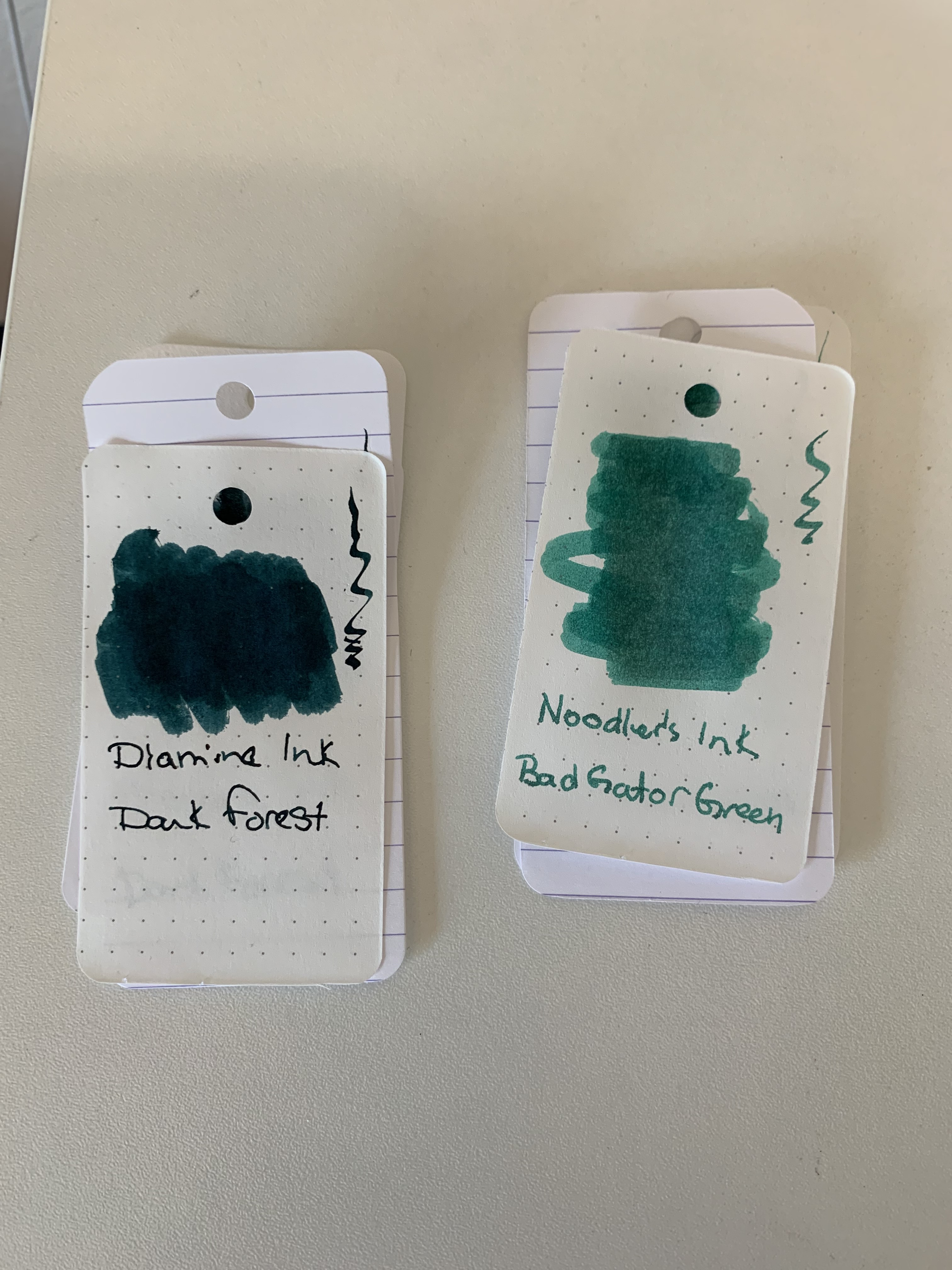
The final two inks were the recent surprise me samples. Both were actually in the green family.
Diamine Ink Dark Forest & Noodles Ink Bad Gator Green.
While I was swatching I also jotted notes down in a field notes ledger – denoting if the color came from a bottle or a sample and the dip pen I used. It’s another quick reference for me to be able to take with me and refence what I have and what I’ve sampled.
I cleaned up my desk and pens while I let the all of the swatches dry. When I felt that they were dry enough I sorted them into their respective ink books and left them alone for the day.
This morning I decided to look at how the inks behaved in each book. And I have to say I was quite surprised by what I found while flipping through the books comparing swatches.
- I think I need to find the De Atramentis Document Ink Yellow a new home. Of the three doc inks it is my least favorite. I only had slight difficulty reading the ink while I was writing with it and it did darken/deepen as it dried down but I’m not going to be inclined to use it unless I happen to have darker paper.
- I didn’t realize that two of the inks were sheening inks before swatching them. For a solid 10 minutes I thought I might have contaminated my bottles in some way because when I write with Diamine Syrah or Pilot Iroshizuku ku-jaku the sheening doesn’t come through (I can’t recall the actual pens/nibs I’ve used with them to determine if that was the reason) AND it almost looked like they shimmered. Except that neither ink has shimmer particles in them. I swatched Syrah a few more times on scrap pieces of paper and then looked for examples on-line. When I found several photos depicting swatches that sheened for both ink colors I breathed a sigh of relief. I hadn’t somehow contaminated my ink bottles.
- Shimmer inks are really pretty on the right paper. And oh my word is Diamine’s Firely beautiful.
- I feel like I need to try a broad nib with most of the inks I own now.
Do you have a large ink… stash? How do you keep track? Do you gravitate towards one color or multiple. Let me know.
That’s it for now.
Much love.
Charlie
