Posted in Fibre

Crochet (Tunisian) – Lamia Wrap

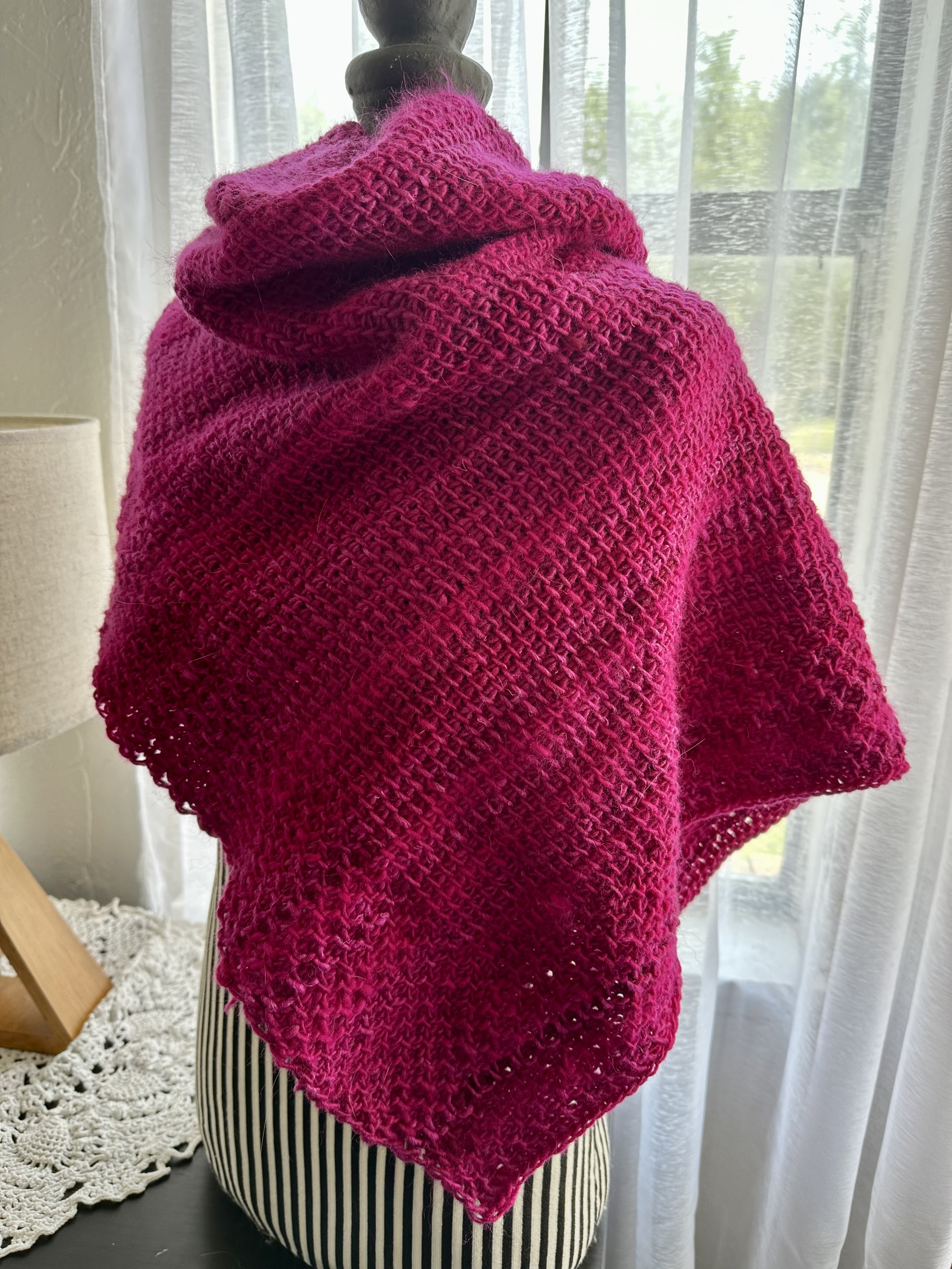
A look at the back of the wrap. The striping alternates between being subtle and not so subtle.

This project came about because I subscribed to Toni’s YouTube channel TL Yarn Crafts a few months ago. She’s a crochet designer that focuses primarily on the Tunisian crochet method. Toni shares tutorials, updates, and reviews of yarn and tools on her channel. You can find many of Toni’s patterns on Ravelry and her blog.

I learned Tunisian crochet ages ago. A single “row” of Tunisian crochet usually consists of a forward pass (in which you keep all the loops you create on the hook) and a backwards pass (you work all the loops off the hook). Depending on the size of the project you will likely have an extremely long hook or a hook with a cable attached to one end with a stopper to keep things from sliding off.

When originally learned this technique I learned the simple stitch and then promptly moved back to “regular” crochet. After finishing my last project I decided to brush up on my Tunisian crochet after catching up on some of Toni’s videos. She described the Lamia Shawl as a friendly beginners pattern that could be finished over a weekend. A combination of a honeycomb pattern and simple stitch pattern the Lamia wrap seemed to offer me just the right amount of challenge to renew my skillset. So I dug through my yarn stash for yarn that I could use.

Harley was not always thrilled with me covering her with the wrap to check my progress. At some point I started rolling the worked portion up.

At first I pulled some Noro Secret Garden out. I worked the first seven rows over and over again. At least six times. By this point I understood what I was supposed to see when translating from page to hook. I also realized that I didn’t want to use Noro Secret Garden due to it’s striping properties (long color runs). So back to the yarn stash I went and the only yarn I had that I had in the needed quantity was Noro Retro in Magenta.

I was at least ten rows into the pattern with the yarn when I realized that it was a semi solid color which was hard to tell simply looking at the ball of yarn. So I still ended up with a striped fabric in the end. Just more on the subtle end.

I started this project on April 12th, 2023 and it came off the hook on May 24th, 2023. I worked on the wrap for a few hours every morning for most of that time. I took a break for a few days towards the end. Naturally Harley spent a lot of that time on my lap supervising.

Sometimes I take a good close up. The border is worked at the same time as the main part.

In the end I used 6 skeins of Noro Retro which ends up being 606.0 meters (662.7 yards), 300 grams. I should also mention that Noro Retro has a thick yarn/thin yarn situation going on so the texture of the fabric is varied. I have not blocked it yet to it’s final form. Primarily because it’s not going to get worn unless it goes to someone else. (Little known fact about me – I don’t actually wear shawls/wraps even though I love making them.)

For those that might be interested in the information – when I acquired the yarn it was selling for $10 a ball so in material cost alone this wrap is $60.

I enjoyed making the Lamia Wrap and found it to be a great refresher for relearning/remembering how to Tunisian crochet. Toni has a really nice video tutorial that you can follow for this pattern – which I did watch to understand the purl stitch. (Why yes, it is another thing that it has in common with knitting!) I would recommend Toni’s patterns to anyone that is interested in learning Tunisian crochet.

Much love,

Charlie

Posted in Fountain Pens

New Inks

I acquired a few new bottles and samples of fountain pen inks over the last few weeks. The samples arrived this past Friday so I spent the weekend swatching and testing chromatography.

All the swatch books.

SET UP – I started my ink swatch collection initially with four swatch books. Three of them are made of paper that I typically write on with fountain pens – Rhodia (80 GSM), Clairefontaine (90 GSM), and Tomoe River (65 GSM). The reason I swatch inks on these three is to see how the ink and paper get on together. It lets me see exactly how the properties of the ink (sheening, shading, shimmer) is handled by the paper.

The col-o-ring swatch book (160 GSM) functions as a color reference guide for when I am just looking at inks to use. This swatch book is a favorite of many of my fellow ink enthusiasts which was my primary reason for using it. It is also the form factor basis of my other swatch books. It’s does what I need it to do and that was all I wanted.

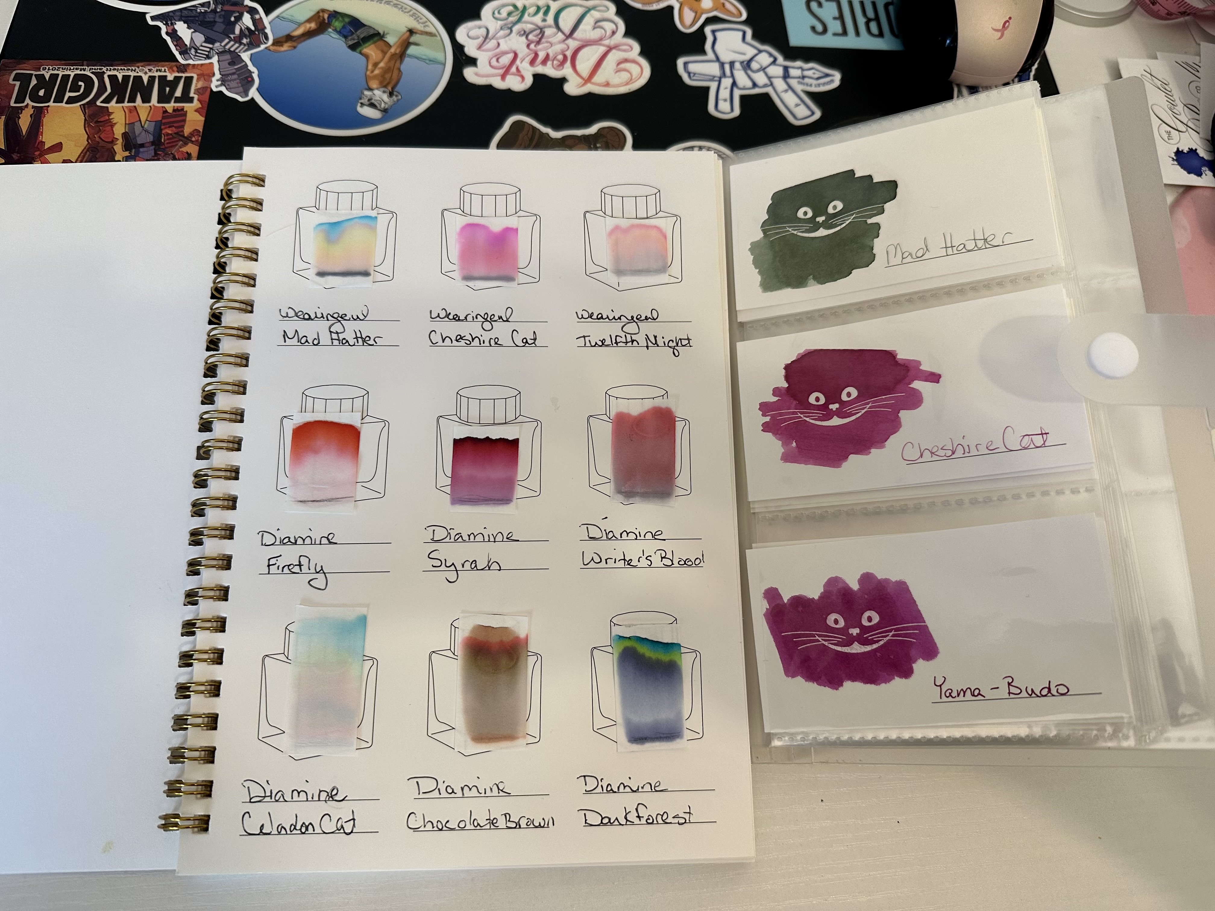
The Chromatography book and some smiling swatch cards both made by Wearingeul.

Then I came across an Instagram post that featured swatch cards from a company called Wearingeul that I absolutely had to own for reasons. I knew they made fountain pen inks that were based on literature. I had recently picked up a 30 ml bottle of Shakespeare Twelfth Night, an Atlas Stationers exclusive ink – a beautiful pink ink with silver shimmer. To find our that they made swatch cards that revealed a particular cat’s smile when you swatch the ink…I couldn’t pass them up. I picked up a pack, the accompanying folder and an additional swatch book that had ink bottles on every page to swatch in. ( I was totally influenced by @seemownay in regards to the additional book) Because the book and the cards were the exact same paper I opted not to swatch the inks a sixth time but instead use the ink bottle swatch book as my chromatography reference guide for fountain pen ink art that I am slowly delving into.

I re-swatched all my inks (twelve at the time) on the cards immediately and have been truly giddy about the cards ever since. I smile every time I look at them. The smiling cat swatch cards (200 GSM) have now replaced my col-o-ring swatch book as color reference even though I still continue swatching in it at the moment. I am debating other uses for the col-o-ring book or possibly passing on the remainder of the book to another ink enthusiast – it would be shy roughly 30 cards..

Celadon Cat, Mad Hatter, Cheshire Cat, Writer’s Blood. The Twisbi is filled with Mad Hatter and I love the combination.

THE INK – In addition to the the bottle of ink I mentioned earlier I also picked up Mad Hatter and the Cheshire Cat inks from the Wearingeul Alice in Wonderland collection while looking for inks that didn’t contain shimmer. (You can see their swatch cards in the picture featuring the chromatography.)

The delivery of ink on Friday consisted of a kit containing eleven of Goulet Pens best selling inks and two bottles of ink. Because one of the bottles of ink was also in the sample kit I gifted the sample to a friend that also enjoyed using fountain pens.

The Inks (in order from left column to right column in the photo)

Column 1:

  • Sample – Organics Studio Nitrogen : A really pretty blue with a purple/red sheen that comes through even when using a fine nib.
  • Sample – Diamine Chocolate Brown : A rich brown that really is reminiscent of semi-sweet chocolate.
  • Bottle – Diamine Writer’s Blood : This ink was voted on/created in collaboration (via voting) with by the fountain pen community on Reddit. It was originally released in 2021. At first swatch I feel like it is a really close match to Diamine Syrah (which is a favorite). Looking at the chromatography it seems Writer’s Blood leans slightly to the paler pink side. (You can see them in the Wearingeul picture above)
  • Sample – Noodler’s Southwest Sunset : A yellow orange color that does remind me of a sunset. It even has an undertone of pink in it when looking at the chromatography. I wouldn’t use this for writing but I can see some potential for art.
All my new ink from Goulet Pens.

Column 2:

  • Sample – Diamine Polar Glow : This was originally part of the 2019 Inkvent Calendar. In my swatches there doesn’t seem to be a lot of sheen however I’ve have seen other swatches of this color that show a red sheen quite similar to Organics Studio Nitrogen, I feel like the blue of Polar Glow leans more towards a teal.
  • Sample – Jaques Herbin Emerald of Chivor 1670 : This is a beautiful teal color that on first swatch I thought of Iroshizuku Ka-Jaku but when I compared the two there was a clear difference.
  • Sample – Organics Studio Henry David Thoreau : This ink surprised me. It’s a really pretty green that leans into blue just slightly and has a beautiful red sheen.
  • Sample – Pilot Iroshizuku Yama- Budo : I’d been wanting to try a sample of this ink for a really long time now. It’s a fushia/magenta color that I love. It’s a little more purple than Cheshire Cat from Wearingeul (see the Wearingeul picture).

Column 3:

  • Bottle – Celadon Cat : This is one of the Reddit colors released this year and I love it. It is such a pretty pale blue greyish color.
  • Sample – Robert Oster Violet Clouds : I love love this color. It’s a pale purple almost lavender color with a pink sheen that has a dark purple border.
  • Sample – Sailor Manyo Nekoyanagi : I can see why Sailor Manyo inks are a favorite. This is a really pale bluish purple with some pink. And you see all three colors.
  • Sample – Sailor Manyo Haha : I hear about this particular color quite a bit in Youtube videos I watch. It has a strong following. A really pretty pale blue green ink It’s similar to Celadon cat just more on the blue side. It writes the same as the other Sailor Manyo ink in that you see all of the colors. but not like a sheen that covers the original color. It’s hard to explain.

And that my friends is it. The only two inks I haven’t technically talked about in any depth are Mad Hatter and Cheshire Cat but their swatch cards are in the Wearingeul picture if you want to take a closer look at them. I swatched them before my Goulet order came in.

What do you think of the colors? See one that might interest you? Let me know what colors you lean towards in the comments.

Much love,

Charlie