It’s hard not to know about Tom’s Studio and the pens he makes. For a time you couldn’t scroll through any social media platform and not see an ad or a “pen-fluencer” talking about Lumos or the Wren. These pens weren’t traditional fountain pens but they made use of fountain pen ink. I thought they were cute but not enough for me to purchase one. At least that was until he released the Write-Off Wren. Specifically, the raspberry and funfetti combination. I went back and forth about purchasing until it was sold out and I submitted a re-stock notification from Dromgoole’s. As often happens, I forgot I requested the notification until it appeared in my email in early January. I had just had a discussion about not spending much for 2026 and still found myself placing the order for this little pen. (The colors are so cheerful.)
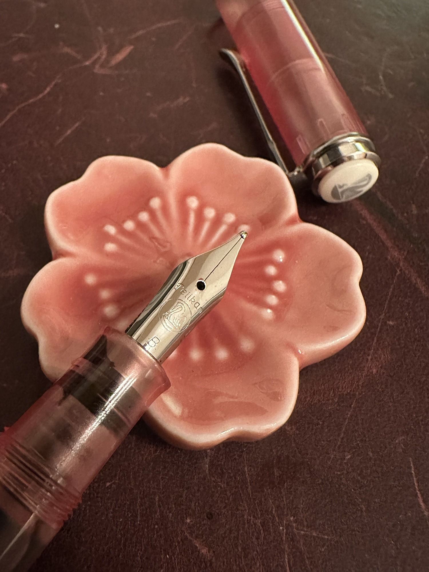
The Write-Off Wren comes in a windowed box to show off the cap. The box itself contains the pen, a single reservoir, a tip/nib, and a sample bottle of Tom’s Studio ink (black). I was surprised that it didn’t come with a few extra nibs or reservoirs. Especially given the sales pitch that you can change inks by switching reservoirs.
For a moment I was a little disappointed by the lack of extra reservoir until I realized I was likely only going to use a dark ink – in this case Tintype from Birmingham Pen Co. not changing the ink negates the need to get replacement tips or reservoirs.
(Note – the reservoirs are little plastic tubes filled with cotton that pulls ink in for use. If you only have one reservoir and you feel like changing inks before the reservoir is empty you basically waste what ink is left when you rinse it out.)
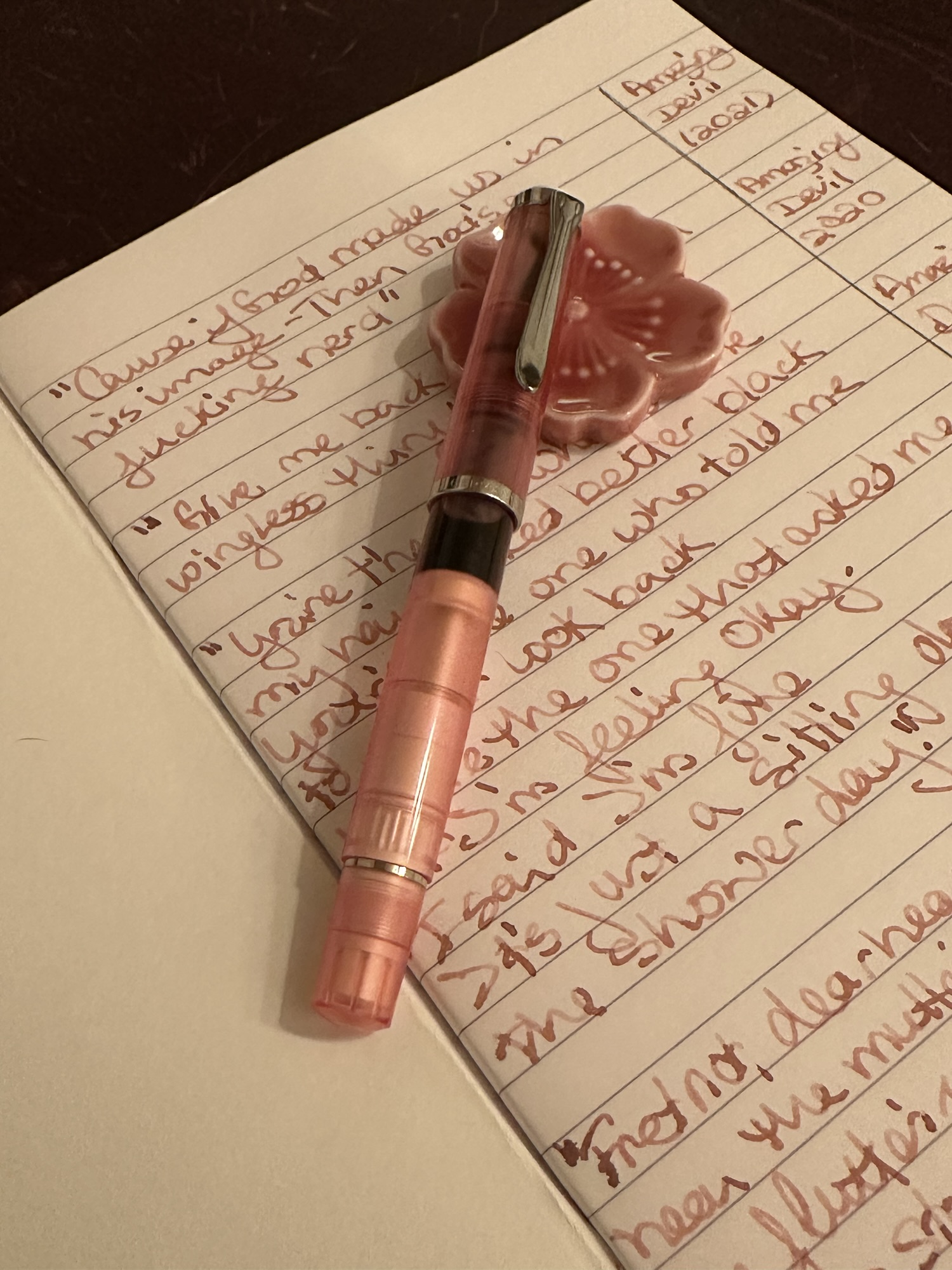
The Write-Off Wren is a pocket pen. When the pen is posted it fits comfortably in my hand. Once the pen is primed with ink it writes smoothly and works equally well for quick notes and longer writing sessions for me.
I think this pen would be a great pen to toss into your bag (which is what I am likely going to do) as an alternative to a pocket fountain pen. I’m not exactly worried about the Write-Off Wren breaking or leaking in some way. And I still get to use fountain pen ink.