Posted in Ink

Inky Thoughts

It’s inevitable, at least in my opinion, that when you get into the hobby of fountain pens you will eventually fall into the rabbit hole that is fountain pen ink. How long one stays there is up to each individual, but you will end up there at some point.

I know that I currently have more ink than I will ever use writing or with my art. I’ve slowed down in purchasing new ink to actually focus on what I already have, but occasionally, an ink just absolutely has to be collected.

I’m a huge fan of a comic series called Lore Olympus by Rachel Smythe. (Per Wikipedia – The comic is a modern retelling of the relationship between the Greek goddess and god Persephone and Hades.) One of the things that I really like is the way color is used.

The first of seven volumes.

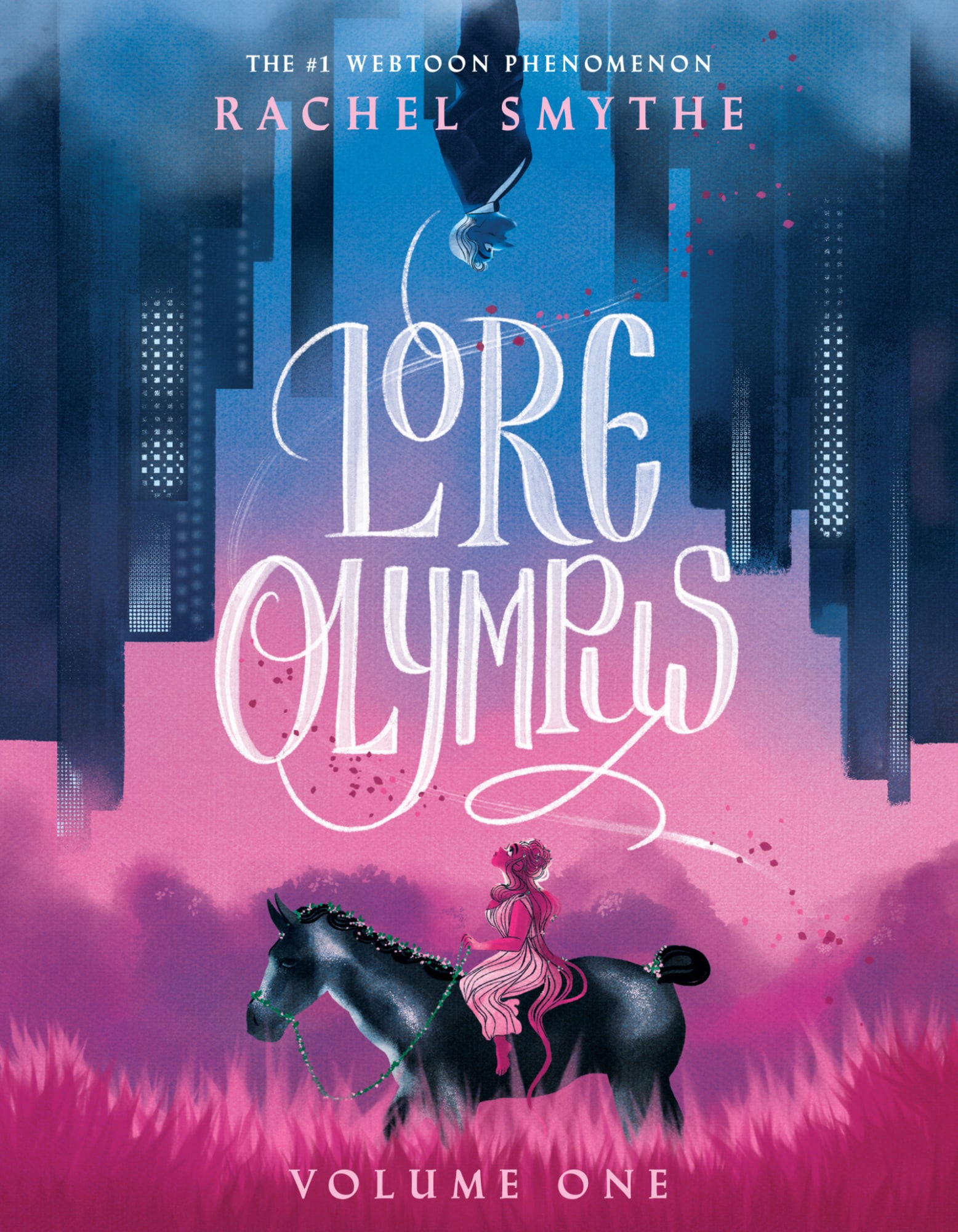
Why am I mentioning this in a post about ink? Well the two inks I’m writing about today are Persephone and Hades.

If you aren’t familiar with Wearingeul, the thing to know is all of their inks are inspired by literature. Persephone and Haydes are part of their World Myth (Greek and Roman) line of Inks. Wearingeul will on occasion release two inks together, for example, they released Romeo & Juliet together. Persephone and Haydes would have been an awesome pairing to release at the same time, however they were not. Persephone was released first and was hard to find at US retailers for a bit. I added a bottle of it to my collection in February. Four months later I managed to find a bottle of Hades in stock after learning of its existence. I found both inks at Droomgoole’s. A recent google search told me that more shops had both inks as of me writing this though.

One of the things I love about Wearingeul is they add a swatch card with color values in RGB and Pantone with each of their inks.

Per Wearingeul about Persephone and Hades:

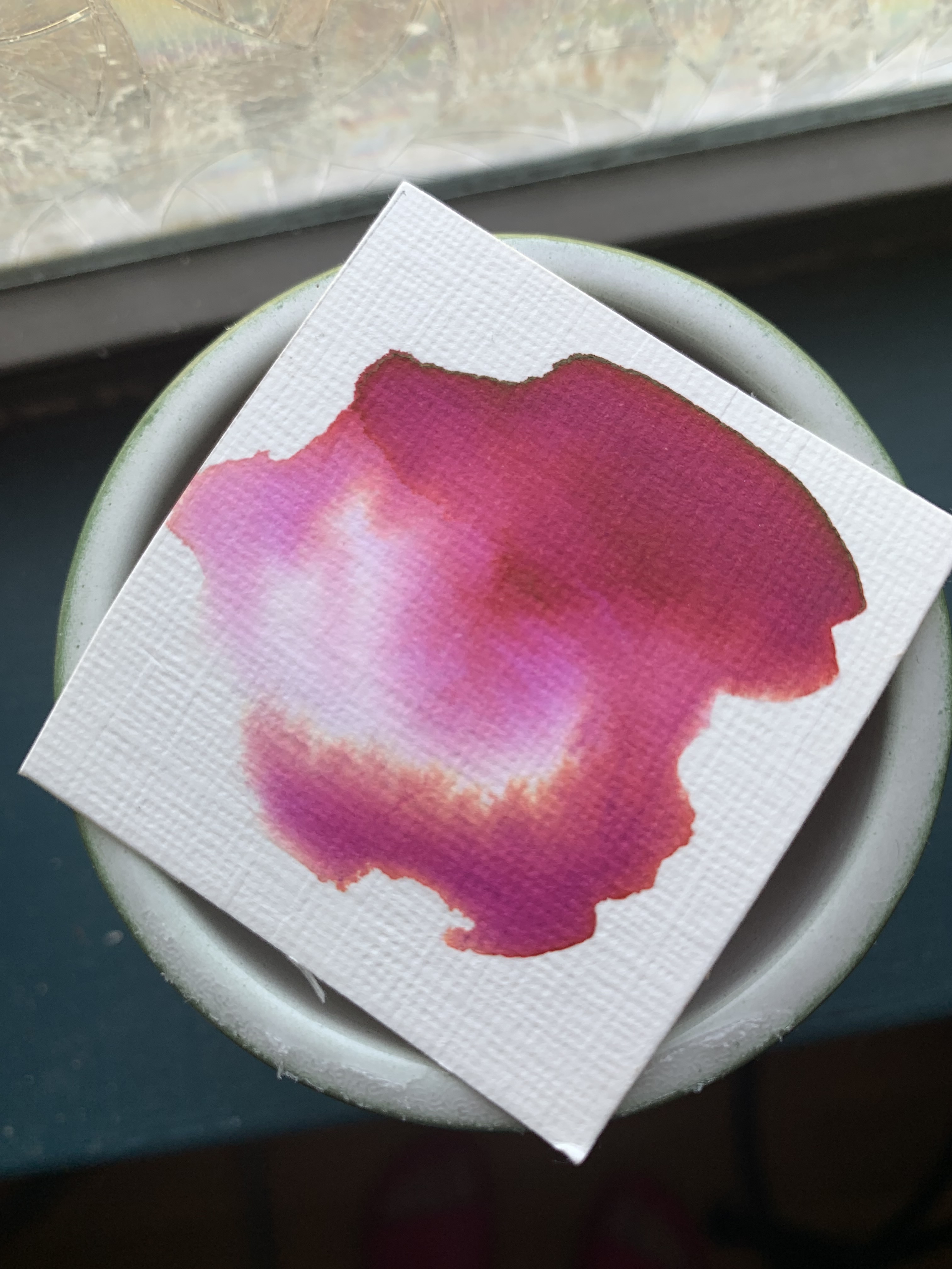
In Greek and Roman mythology, Persephone is the goddess who, after being abducted by Hades, becomes the queen of the Underworld. The Persephone ink is a dark violet color, infused with a heavy and death-laden atmosphere, embellished with red glitter symbolizing pomegranate seeds.

An Ink inspired by the god Hades, who rules over death, it embodies restrained beauty with a deep black reminiscent of the underworld. Enhanced by a frozen-blue glitter, it exudes an ethereal elegance, capturing the essence of the afterlife.

Pretty flowery but accurate descriptions of the inks, though you can’t really see the glittering aspects very well in my picture. I don’t know what inspired Rachel to use color the way she did in Lore Olympus, but it wouldn’t surprise me to learn that Wearingeul took even a small cue from Rachel’s work. (Also, I could just be oblivious to which colors are typically associated with Greek goddess and gods. It’s not something I think about often.)

I really like both Persephone and Hades. Persephone has really pretty chromatography and that frozen blue glitter in Hades really pops when I write with it. Sorry, I don’t have a writing sample to share. Both inks are smooth and not overly wet. Perhaps that’s because I tend to use medium to broad nibs mostly.

Chromatography. Left is Hades. Right is Persephone. That pink in Hades was a surprise.

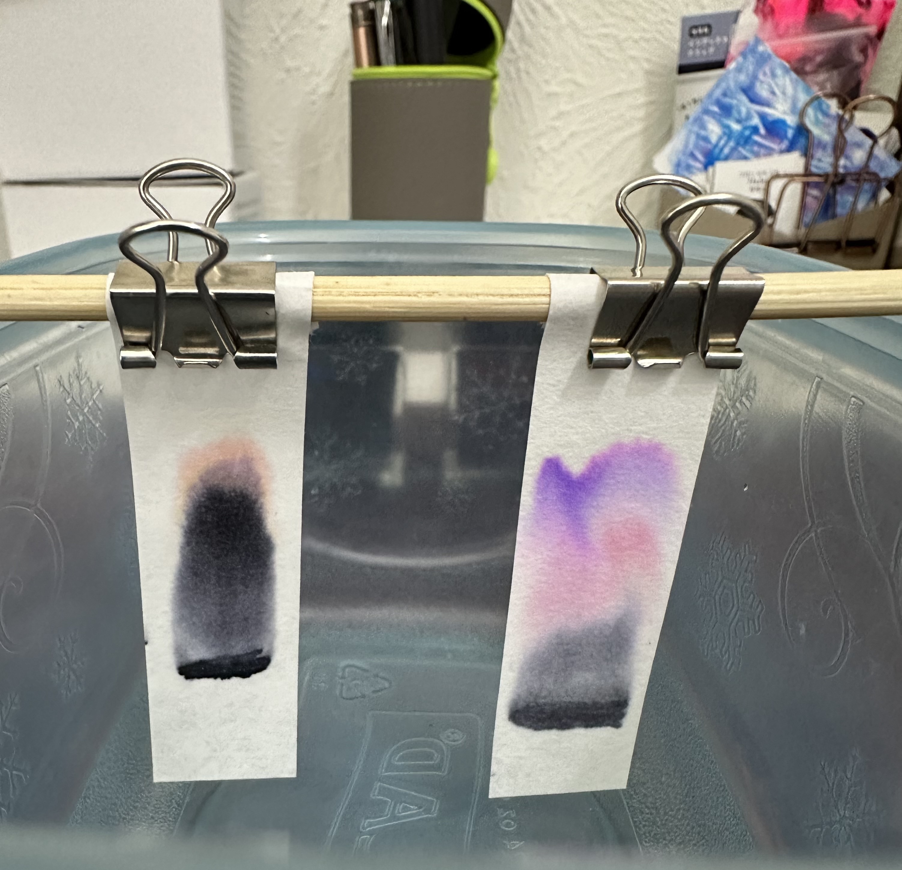
As with just about all shimmering inks, I’d recommend a fountain pen that is easy to disassemble for cleaning and a nib larger than a fine – because using a shimmering ink in a fine nib fountain pen makes no sense to me – I want to see the glitter!

Have you used these inks before? Do you have something similar in your ink stash that could be dupes for it? Let’s chat about it.

Posted in Fountain Pens

Exploring Ink via Science

There are a lot of things that fountain pen users look at when choosing an ink to use. Is an ink wet or dry? [Wetter inks have a faster flow while dry inks have a slower flow and more surface tension.] They also ask about the Three S’s .Is the ink a shading ink? [A result of a fountain pen ink pooling in certain parts of a letter when writing, so that the color and saturation of the ink appears different within a single letter or word.] Does the ink sheen? [When the fountain pen ink pools another color can be seen on top of the ink, especially when looked at in different light angles using certain paper types.] And the final S – does the ink shimmer? [Fountain pen ink that has small particles of glitter mixed in.] A common aspect that is also looked at is how water resistant the ink is. [Water resistance means that a portion of the ink will remain after being subjected to water. This might only be one ingredient of the ink, leaving behind a legible remnant with little or no representation of the original color.]

My current collection of bottled ink has five shimmering inks. At least one of my inks has some shading properties and another seems to have sheening properties that are dependent on the amount of ink put on the paper. Three of my inks are highly water resistant (I’d expect so since they are document inks)

There is another aspect that of fountain pen ink that I have decided to explore. That is the chromatography.

In chemical analysis, chromatography is a laboratory technique for the separation of a mixture into its components. The mixture is dissolved in a fluid solvent called the mobile phase, which carries it through a system on which a material called the stationary phase is fixed.

Wikipedia

In the case of fountain pen inks I am looking at the varying colors that make up each ink by putting fountain pen ink on a highly absorbent piece of paper then using water as the fluid and observing the different colors in the ink separate as they travel up the paper.

For my experiment I used Chromatography Paper Strips that I purchased on Amazon. After drawing a line of ink on each strip with either an inked fountain pen or a dip pen I attached the strips to a wooden dowl that I could suspend over a small bowl of water making certain that the ink line was not submerged when the paper touched the water. I set a timer and retrieved the paper at the 1.20 minute mark and let the water to continue working its way up the paper then waited for it to dry.

Ten ink samples (7 bottle inks, 1 cartridge ink, 2 samples)

Inks Tested

Top Row

  1. Wearingeul Twelfth Night, a sliver shimmering pink ink (bottle)
  2. Diamine Firefly, a gold shimmering orange ink (bottle)
  3. Ferris Wheel Press The Fluttering Heart, a gold shimmering pink ink (bottle)
  4. Platinum Black, a standard black ink (cartridge)

Middle Row

  1. Diamine Syrah, a wine colored ink (bottle)
  2. Pilot Iroshizuku Ka-Jaku, a teal colored ink (bottle)
  3. Jacques Herbin 1670 Stormy, a gold shimmering grey ink (bottle)
  4. De Atramentis Black Currant, a scented purple ink (bottle)

Bottom Row

  1. Diamine Dark Forest, a dark green ink (sample vial)
  2. Noodler’s Ink Bad Gator Green, a green ink (sample vial)
Note: There were a few inks in my current ink collection I did not test – my document inks as I already know from a previous chromatography trial that they do not separate and a shimmering ink that I intend to give away or parse out samples from that I do not intend to use further.

My Observations and Thoughts

I really need to cultivate more patience when it comes to waiting for results. Though this test was meant to separate colors it also showed me which inks are really not water resistance as the lines completely vanished as the water progressed up the strip. The two shimmering pink inks surprised me. The Fluttering Heart leans more brown than pink when compared side by side to Wearingeul Twelfth Night and in the chromatography it seems that the difference is the addition of yellow. I was also surprised to see the yellow and pink in Stormy Grey show up.

After looking closely at the dried strips of paper it quite surprised me to find that many of the inks that seemed to fade completely from the origin line displayed very light grey. I don’t think this is an indication of color but perhaps it is an indication of the inks lubrication. I may look into this further in the future, but for now it’s just an interesting observation.

Overall I wasn’t really surprised or wowed by the results of these inks. Partially because this was my second attempt at chromatography testing with these inks and partially because I have come across some amazing chromatography examples from other pen and ink enthusiasts.

Bonus

One of the many reasons I decided to explore chromatography was that I wanted to be able to fully use up the inks that I own and one of the ways to do that is through art. I came across Nick Stewart on Instagram (quinkandbleach) and was absolutely taken with the idea of creating art using chromatography.

While this isn’t quite the paper finish that Nick recommends in his tutorials (it’s not rough or rough enough) it is the right weight of paper – 200lb. This was one of my first attempts to see if I could do chromatography swatch. It didn’t work out (in this case I really think it was the finish of the paper that made the difference.) But I like it nonetheless. You can actually see the brilliant orange and the bright pink come through in Diamine Syrah which is one of, if not absolute, my favorite inks.

Much love,

Charlie

P.S. If you happen to have ink samples you no longer need or want or are just in the habit of sharing inks with other enthusiasts let me know. I’d be happy to share from my small collection. If you use the Fountain Pen Companion you can find me under Charlie M to look at my ink collection.